New Paramount logo is fine unless you think about it too long

New Paramount logo is fine unless you think about it too long
A potential new Paramount logo

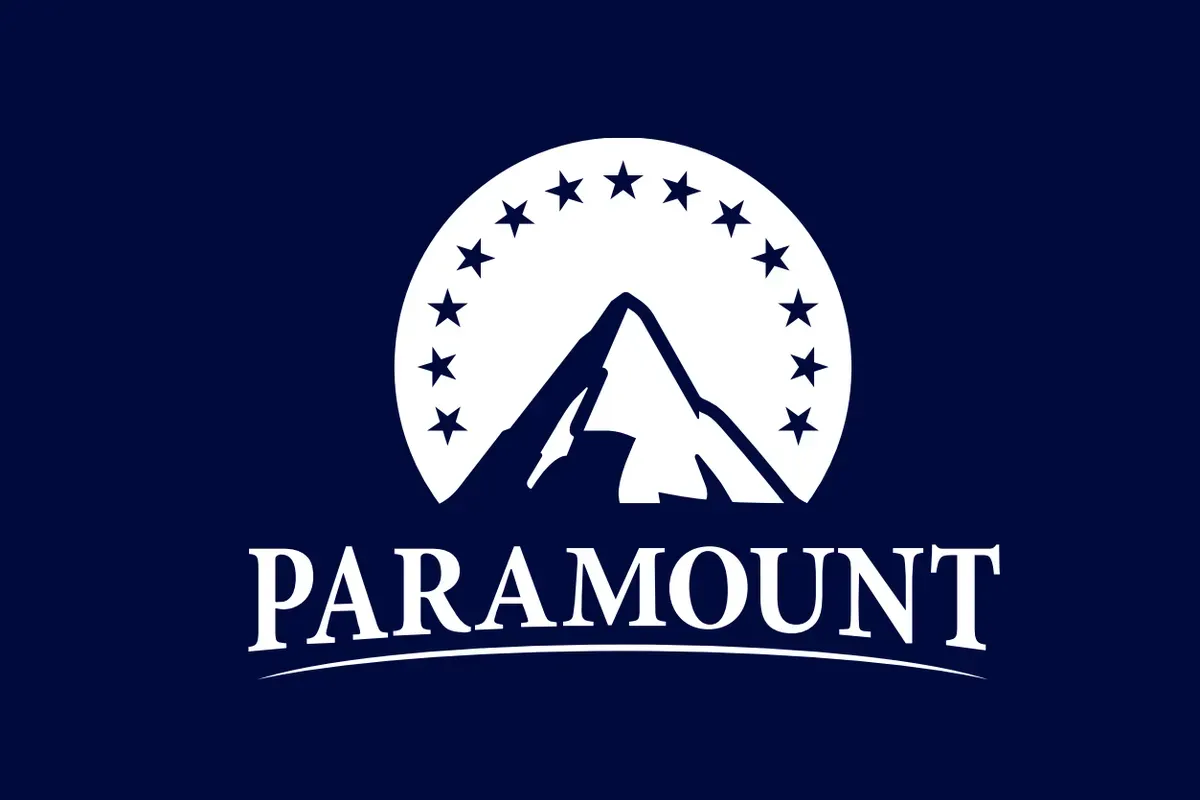
As its merger with Skydance becomes more and more likely, Paramount Global has shared a possible new logo that tries to mash the two brands together.

If I didn't know that bit of context, I honestly wouldn't mind the seemingly old school all-caps font choice. It kinda looks like a throwback in a world of generic sans-serif fonts.

That was until I saw it alongside Skydance's logo:

The existing Skydance logo

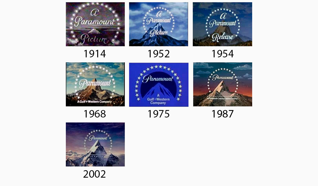
For context, Skydance Media was formed in 2006. Which means the retro look is actually just Paramount throwing away cursive branding that has existed in some form since 1914 for one made by the brat son of a tech billionaire.

Paramount Pictures logo: History, Meaning and Evolution | by Ilya Lavrov |  Turbologo | Medium
Source: Turbologo
The existing Paramount logo

In more serious news locally, the sale may have consequences for struggling third-place network Channel 10. Last week executives attempted to "calm staff" as the merger, and subsequent large cuts, became more likely.

Network 10 boss moved to calm staff amid Paramount merger talks, industry job cuts
During a town hall last week, Network 10 president Beverley McGarvey tried to assure staff on the future of the network amid Paramount merger talks and local media job cuts.
Paramount earmarks $3 billion in cuts
Paramount bosses have earmarked close to A$3 billion in cost savings following this week’s announcement that Skydance Media will acquire Paramount’s owner, National Amusements, and merge Skydance with Paramount Global to form New Paramount.In a transaction presentation seen by Mumbrella, Paramount outlined “significant opportunities for value creation across the enterprise following a comprehensive review and […]